Welcome To My Blog for EDCI 337!

Category: Multimedia Learning (Page 1 of 2)

Assignment 4 – Multimedia Design Group Project – Introduction to Electronic Health Records (EHRs)

1. Introduction

Currently, electronic health records (EHRs) are increasingly implemented into healthcare settings to replace the traditional paper-based patient record (Ratwani, 2017). This learning content is designed to educate students on EHRs. The structure of this course is divided into three sections: Pre-Class, In-Class, and Post-Class learnings. By the end of this learning plan, students will gain a basic foundation of knowledge on the topic of EHRs.

2. Skills/Learning Outcomes

By the end of this course, students should be able to:

  1. Define EHRs.
  2. Explain who uses EHRs and why.
  3. Describe where EHRs are used.
  4. Explain what information is stored on EHRs.
  5. List the benefits and drawbacks of EHRs.

3. Topic Rationale

Considering all of our group members are in the Health Information Science (HINF) Program, we chose EHRs as our assignment topic. Additionally, since EHRs are becoming more widely adopted, our group’s intention in designing this lesson plan was to provide students with a basic understanding of EHRs, who uses them, where they are found, what they store, and their benefits and drawbacks.

For this assignment, the topic which inspired our group was: Topic 4 – Design of Multimedia Learning Objects and Artifacts. EHRs are a subject HINF students are continuously educated on throughout the duration of the program; however, the delivery of learning is lecture-based and supplemented with text-heavy PowerPoints which can cause information overload. As a result, our group created multimedia objects often used in the HINF program and applied the educational principles we learned in EDCI337 to ensure the instructional design was learner-centered.

4. Project Plan

To create our multimedia objects, we brainstormed and created a list of common multimedia objects which are listed below in section 5. The work to create these multimedia objects was split between group members during our weekly learning pod meetings. Once all group members completed their individual multimedia objects, we worked collaboratively on writing the discussion post. The plan for this assignment went relatively well, and there were no pitfalls.

5. Original Multimedia Content

All except the additional readings are original multimedia content. The multimedia produced varies in type and draws upon EDCI-related learnings. Original multimedia content includes:

â—Ź YouTube Video
â—Ź Infographic
â—Ź Quiz
â—Ź PowerPoint
â—Ź Discussion
â—Ź Activity
â—Ź Written/Audio Recording Prompt
â—Ź Reflective Quiz

The multimedia objects can be accessed from this overview.

6. How Students Will Be Evaluated

â—Ź Pre-Class Quiz: The pre-class quiz will allow instructors and students to assess initial comprehension of the material. Based on the results, instructors and students can identify which areas may need more focus.
â—Ź In-Class Discussion: Discussions are a great way to foster engagement. The in-class discussion will give students an opportunity to network and have conversations about the topic. Additionally, this discussion will allow students to identify areas they need to focus or improve on.
â—Ź Post-Class Activity: This activity is a unique way to evaluate student comprehension through the use of images, and fill-in-the-blank questions. Following this, students can compare their answers to the answer key to determine which areas may require review.
â—Ź Post-Class Prompt: The post-class prompt has no right or wrong answer. Rather, it is an exercise to understand what students learned throughout the learning plan. This reflection is also a great way to identify areas students struggled with.
â—Ź Post-Class Reflective Quiz: To reflect upon their learnings, students will be given a post-class reflective quiz. Additionally, this quiz will be used to gather feedback from students to improve the learning plan for future students.

The evaluation method for this learning plan is also applicable to other theory-based topics.

7. Discussion

Multimedia can be defined as the simultaneous presentation of both words and pictures (Mayer, 2014). Learners can create a deeper understanding of multimedia while they form connections between words and pictures; however, to be effective, multimedia must be designed in a manner that promotes learning (Mayer, 2014). Given this, our group implemented several different principles and learning theories where appropriate while designing our multimedia objects for this assignment.

Overall, this assignment was designed to engage learners to be active participants. This was achieved by having students progress through pre-class, in-class, and post-class tasks to help assess their comprehension of the material, and learning outcomes (Betts, 2016). For example, in the post-class prompt, students are asked to use higher-order thinking skills by writing, or audio recording their answer to one of the provided prompts. This exercise aligns with the “create” element of Bloom’s Taxonomy, which encourages active learning, and evaluates student comprehension as students produce new or original work related to the material (Betts, 2016).

One major principle our group implemented was demonstrated in our informational video and PowerPoint presentation. More precisely, our group decided to use illustrative images and short text in these multimedia objects, and provided further detail via narration. In doing so, we were able to improve learning by applying the modality principle: people learn better when graphics are paired with narration instead of printed text (Mayer, 2014). This strategy was also listed as one of Phillip’s key takeaways for creating effective presentations (TED, 2014). Additionally, we made sure to speak in a conversational style during our narrations. This is because according to the personalization principle, learning improves when the words of a multimedia presentation are not spoken in a formal style (Mayer, 2014).

To capture learners’ attention, color was an element our group took advantage of while designing our multimedia objects. For instance, while creating our informational video, our group decided to use contrasting colors to add emphasis to its design. This is because one of the principles of good design is contrast, and this principle suggests using opposing design elements, such as color, to support design (Adobe Express, 2020). Similarly, the same principle was applied during the creation of our infographic. In particular, our group selected the color purple for the background of our infographic to contrast with the overlaying graphics.

Contrast was used in the PowerPoint presentation to guide learners’ eyes around the information presented on the slide. Again, this strategy was also listed as one of Phillip’s key takeaways for creating effective PowerPoint presentations (TED, 2014). In this case, however, contrasting colors on opposing segments of the color wheel were not used. Rather, topics that were being discussed on the current slide were colored, and extraneous materials were grayed out and excluded (Mayer, 2014). As a result, we were able to improve learning by emphasizing key information through the application of cues (Mayer, 2014). Further, in applying this strategy, both the coherence and signaling principles were achieved, respectively.

Lastly, it was important that differentiated learning styles were considered when creating our materials. For example, with the in-class discussion, students are given the choice to either actively engage in conversation with their peers, or to provide a written response. This same idea was used in the case of the post-class prompt, where students are able to provide either a written or spoken response. In providing multiple pathways for learning, the material becomes more accessible and inclusive for all learners (CAST, 2018).

Note: All multimedia content is linked to a publicly shared Google Drive.

References

Adobe Express. (2020). 8 basic design principles to help you make awesome graphics. Adobe. https://www.adobe.com/express/learn/blog/8-basic-design-principles-to-help-you-create-better-graphics

Betts, T. (2016). 5 tips for multimedia enhanced teaching and learning. University of Sussex. https://blogs.sussex.ac.uk/tel/2016/11/22/5-tips-for-multimedia-enhanced-teaching-and-learning/

CAST. (2018). Universal design for learning guidelines version 2.2. Retrieved from http://udlguidelines.cast.org

Mayer, R. E. (Ed.). (2014). The Cambridge handbook of multimedia learning (2nd ed.). Cambridge University Press. https://doi.org/10.1017/CBO9781139547369

Ratwani, R. (2017). Electronic health records and improved patient care: Opportunities for applied psychology. Current directions in psychological science, 26(4), 359–365. https://doi.org/10.1177/0963721417700691

TED. [TEDx Talks]. (2014, April 14). How to avoid death by PowerPoint | David JP Phillips | TEDxStockholmSalon [Video]. Youtube. https://youtu.be/Iwpi1Lm6dFo
Blog Post Feedback #7 – Design of Multimedia Learning Objects and Artifacts

Hi Xinh,

Your blog post about the Design of Multimedia Learning Objects and Artifacts is thorough and easy to understand. I really liked how you explained each of the 3 components of the Cognitive Load Theory (CLT) such as effective load, ineffective load, and task difficulty load. In addition, the YouTube video in your blog post relates to your topic very well and summarizes cognitive load theory in a short and visually effective way. The poster you created on Canva shows a great example of CLT. For example, it is straight to the point, and visually appealing.

Well done and thank you for sharing!

Yashvi Shah

Blog Post Feedback #6 – Evaluating Using the SECTIONS Model

Hi Katie,

Your blog post about Evaluating Using the SECTIONS Model is very well written and easy to follow. I really liked how you explained the SECTIONS model in detail, such as what each of the letters stand for and their meaning. I also liked how you incorporated real-life applications of SECTIONS and specifically relating it to the Health Information Science field.

As a reader and someone who also learns better with visual content, it was really helpful to see the infographic about TELUS Med Access SECTIONS Evaluation. It was visually appealing and straight to the point.

 Great post and thank you for sharing!

Yashvi Shah

Blog Post 6 Feedback – How Do We Evaluate Multimedia and Multimedia Tools

Hi Grace,

Thank you for sharing your blog post about How We Evaluate Multimedia and Multimedia Tools. Each of the 3 models were written in detail and very easy to follow. I like how you incorporated 2 different forms of multimedia such as the images used to describe the TPACK and SAMR models, and the video to explain the SECTIONS model. I agree with your point that without technology, many educators would struggle to get their lessons across to their students. Especially since the pandemic, many educators realized the importance of technology in education. I am curious to know what was the first form of technology you used in school and at what age? Personally, I remember the first form of technology I used was a SMART Board in third grade.

Great post!

Yashvi Shah

Blog Post 6 – The Difference Between TPACK, SAMR, and SECTIONS

TPACK

TPACK stands for Technological, Pedagogical and Content Knowledge. It is a framework that is used to identify necessary educator knowledge to integrate technology within the complexities of the larger context of teaching (Kirkland, 2014). In TPACK, Technological Knowledge (TK) is most effective when it is combined with deep Content Knowledge (CK), which means curriculum subject matter, and Pedagogical Knowledge (PK), meaning teaching strategies and knowledge (Kirkland, 2014). This combination provides an effective filter for educators to examine the way that they think about technology integration (Kirkland, 2014). To watch a quick summary about TPACK, click on the video provided below in Figure 1.

Figure 1 – Quick Overview of TPACK (Candace R, 2013)

SAMR

The SAMR is a model that is categorized into four degrees of classroom technology integration. It stands for Substitution, Augmentation, Modification, and Redefinition (Kirkland, 2014). This model provides a framework for assessing the richness of the technology tasks used for learning. To watch a quick summary about SAMR, click on the video provided below in Figure 2.

Figure 2 – Quick Overview of SAMR (Candace R, 2013)

SECTIONS

The SECTIONS Model is a framework that allows educators to evaluate the effectiveness of applying certain technology in their classrooms. SECTIONS refers to 8 unique areas. These are known as Students, Ease of Use, Costs, Teaching and Media, Interactivity, Organizational Issues, Networking, , and Security and Privacy (UBC, 2021). To learn more about SECTIONS, click on the video in Figure 3 which provides a quick overview about SECTIONS.

Figure 3 – Quick Overview of SECTIONS (Michell Acala, 2016)

References

Michell Acala. (2016, September 22). SECTIONS MODEL [Video]. YouTube. https://www.youtube.com/watch?v=0zgx9eonXGI

Candace R. (2013, May 30). SAMR in 120 Seconds [Video]. YouTube. https://www.youtube.com/watch?v=us0w823KY0g

Candace R. (2013a, April 26). TPACK in 2 Minutes [Video]. YouTube. https://www.youtube.com/watch?v=FagVSQlZELY

Kirkland, B. (2014). SAMR & TPACK – Design for Learning: A Discovery Guide for Librarians. By the Brooks Design for Learning. https://sites.google.com/site/bythebrooksdesignforlearning/samr

The University of British Columbia (UBC). (2021). SECTIONS Model – Assessing Technologies in the Classroom | Scarfe Digital Sandbox. Scarfe Digital Sandbox. https://scarfedigitalsandbox.teach.educ.ubc.ca/sections-model-assessing-technologies-in-the-classroom/

Assignment 3 – Core Multimedia Skills

Interactive multimedia learning refers to online instructions that combine multimedia with activities to help learners apply their understanding and receive feedback (Biffi and Woodbury, 2019). There are various forms of multimedia such as images, videos, audio, and text, that can be used in education and make learning a fun experience.

Personally, infographics have been my favourite way to learn. As a student in the Health Informatics program, I have had numerous opportunities to create infographics for course assignments. As someone who also enjoys doing art, I found infographics as an opportunity to be creative and have fun while learning new material.

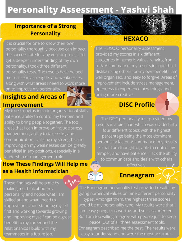
For Assignment 3 in EDCI 337, the multimedia object that I previously created is an infographic about personality assessments. I created this infographic on Canva for a Health Information Science course I did in the Fall semester of 2021, also shown in Figure 1 below. After learning about the various multimedia principles in EDCI 337, I can notice areas in the infographic that can be improved.

Figure 1 – Original Infographic – Fall 2021

Multimedia Principles

The Cognitive Load Theory developed by Richard Mayer describes how learners process multimedia information and how the design of learning materials can be improved to achieve positive learning outcomes (Biffi and Woodbury, 2019). This includes extraneous load and intrinsic load. For this assignment, I would like to dive deeper into extraneous load which refers to wasted cognitive effort on details that do not support the learning outcomes. Extraneous load can be prevented by only focusing on the necessary information (Davis, 2020).

The Limited-Capacity Assumption states that people have a limit on the amount of information they can process at a given time (Davis, 2020).

Updated Multimedia Object

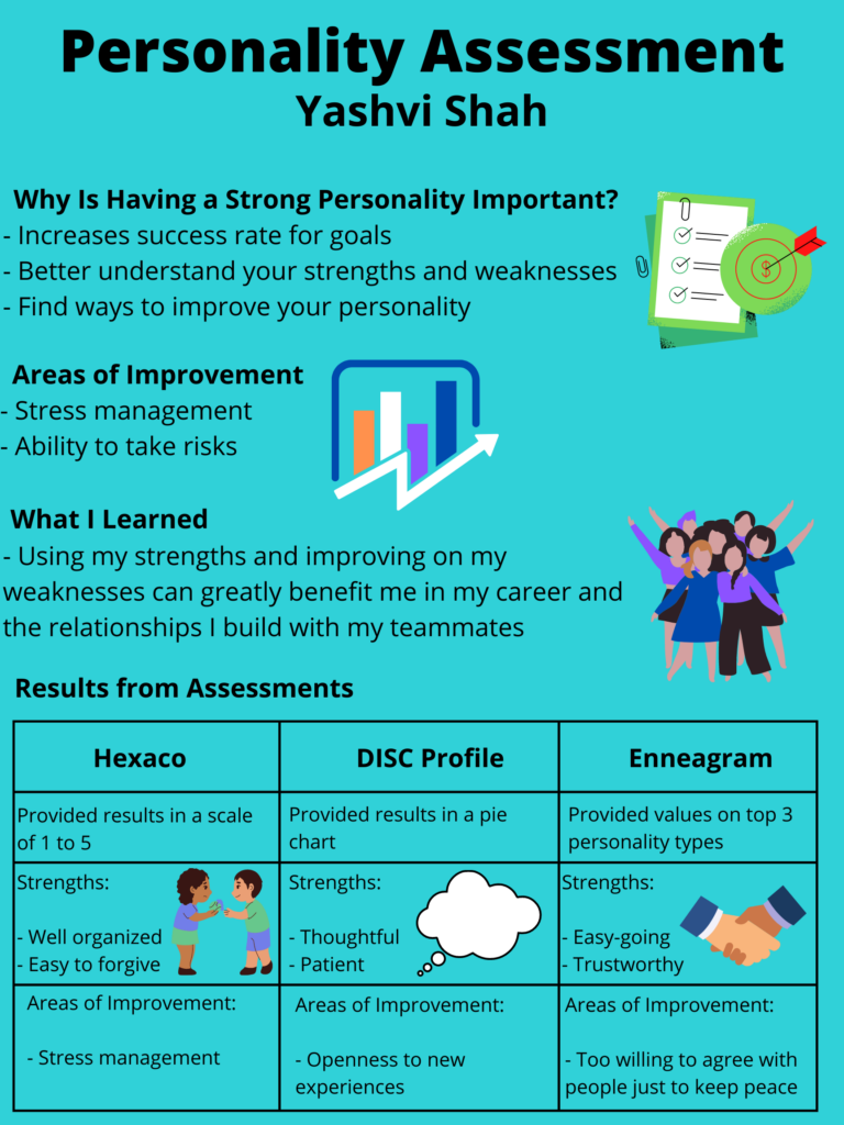
I took these multimedia principles into consideration when reviewing and re-designing my previous infographic. Figure 2 below shows an improved version of the infographic.

Figure 2 – Improved Infographic – Summer 2022

Firstly, I noticed that it was text heavy. Therefore, I minimized it by only keeping the essential information. I also realized that the information needs to be more spaced out. Since it was previously in paragraphs, I changed to bullet form to allow the information to be seen and understood more easily.

According to Mayer’s observation, people learn better when interactive multimedia, such as text and images combined, is used. I agree with Mayer’s observation and therefore ensured I used more colours, fonts, and images when re-designing the infographic to make it more visually appealing. I also incorporated a table to compare my personality assessment results side-by-side to make it easier and faster to process the information at the given moment.

References

Davis, G. (2020, January 31). Principles of Multimedia Learning. Center for Teaching and Learning | Wiley Education Services. https://ctl.wiley.com/principles-of-multimedia-learning/

Biffi, E., and Woodbury, M. (2019). Interactive Multimedia Learning vs. Traditional Learning in Optometry: a Randomized Trial, B-scan Example | The Journal of Optometric Education. Association of Schools and Colleges of Optometry (ASCO). https://journal.opted.org/article/interactive-multimedia-learning-vs-traditional-learning-in-optometry-a-randomized-trial-b-scan-example/#:%7E:text=Interactive%20multimedia%20learning%20is%20defined,receive

Updated Blog Post 2 Feedback (With Pingback) – Learning Tools

Hello Grace,

Great blog post about Learning Tools! It was straightforward and very easy to read. As you mentioned, many tools such as Zoom, YouTube, and Google Drive/Documents have become popular especially due to COVID-19. During the pandemic, many students began learning from home, meaning they were away from their classmates and the physical classroom setting. This can make it challenging for many students to learn new material which can also negatively impact their learning process. However, the use of interactive multimedia can significantly help. According to Mayer’s observation, people learn better when interactive multimedia is used, both in their education or workplace. As a result, the use of the tools mentioned above have significantly increased due to COVID-19, and I therefore I agree with your point.

I also like how you incorporated a form of multimedia, such as the image, into your blog post. This image relates to your topic very well.

Thank you for sharing!
Yashvi

Blog Post 5 Feedback – Inclusion & Differentiated Learning: UDL, UID and UbD

Hi Grace,

Thank you for sharing your post about Inclusion & Differentiated Learning: UDL, UID and UbD. It was easy to read and very well written. I really liked how you described 4 different styles of learning. I am also a visual learner; I remember material more easily and faster when it is presented in a visually appealing way, such as an infographic, rather than in the form of a text. I also liked how you incorporated a form of multimedia, such as an image, for each of the 4 learning styles. This makes your blog post engaging and fun to read.

Since you are a visual learner, I was wondering how you study for courses that are heavily text based and what strategies you use?

Great post and well done!

Yashvi Shah

Blog Post 5 – Inclusion and Its Importance in Education

What is Inclusion?

Inclusion refers to all students being educated together. Studies show that students with disabilities can greatly benefit from inclusion because it allows them to learn from their peers. In addition, everyone benefits when support and services are provided in a typical classroom setting (Heartland Community College, 2022).

Students with disabilities might need individualized support to benefit from learning opportunities. However, that does not mean they require different experiences or activities to learn (Heartland Community College, 2022). High quality education for all children requires coordinated efforts in general and special education, healthcare, mental health, and social services. Collaboration is the key to achieving high quality inclusive services (Heartland Community College, 2022).

Figure 1
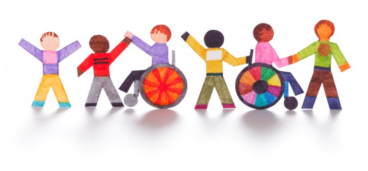
Towards the Inclusion Classroom: Best Practice (Areadne, 2015)

Why is Inclusion Important in Education?

Here are some reasons why inclusion is important in education (Heartland Community College, 2022):

  • Students with disabilities attend the same school as their neighborhood friends.
  • Provides more opportunities to meet new people and build friendships.
  • Prepares students for adult life.
  • Maintains family structure.
    – Siblings can be educated together at the same school.
    – Parents do not have to commute between multiple schools.
  • Enriches learning environment.
    – Diverse teaching strategies for all students.
    – There are additional resources available to all students such as special educators and therapists.
    – Students with disabilities can learn from their peers who act as their role models. This can also help them develop from communication skills.

I remember when I was in elementary school, one of my neighborhood friends was not able to attend the same school as the rest of us because she had a disability. As a result, I believe inclusion is crucial in all schools, but especially in elementary schools. This is because it encourages children to develop a comfortable way to interact with students with disabilities and build friendships (Heartland Community School, 2022). It also allows children to have the opportunity to collaborate with a diverse group of people since a very young age.

Not only would going to the same school benefited us students, but also my friend. It would have allowed her to meet new students and feel connected with them rather then being separated in a different learning environment due to her disability.

References

Areadne. (2015). Towards the Inclusive Classroom: Best Practice [Illustration]. Areadne. https://www.areadne.eu/course/towards-the-inclusive-classroom-best-practice/

Heartland Community College. (2022). What is Inclusion? | Heartland Community College. Heartland. https://www.heartland.edu/heip/family/inclusion.html

Heartland Community College. (2022b). Why is Inclusion Important? | Heartland Community College. Heartland. https://www.heartland.edu/heip/family/inclusionimportance.html

Blog Post 4 Feedback – Creating an Effective PowerPoint

Hello Katie,

Thank you sharing your blog post about Creating an Effective PowerPoint. I agree with your point how there are many websites that provide information on what not to do when creating a PowerPoint instead of informing the reader on what to do. Therefore, I appreciate how you provided tips and tricks on how to create an effective PowerPoint in your blog post. Each of the six rules were written very well. They were straight to the point and easy to read.

I would also like to mention that the multimedia you incorporated in your blog post are very useful. For example, as a reader, it was helpful to see a summary of the six simple rules shown in the image you included. This would also be beneficial especially to those who are just beginning to use PowerPoint and want to keep it as a quick reference. I was curious on if you use any of these six rules for your PowerPoint presentations, and how they have helped improve your overall presentations?

Well done!

Yashvi Shah

« Older posts

© 2024 yashvishah

Theme by Anders NorenUp ↑